Nova Polymers is the global leader in the development of materials and processing equipment for the fabrication of Accessible and ADA compliant signage. With a focus on education and the continued development of innovative materials that meet international accessibility guidelines, Nova continues to lead the sign industry and help people with visual disabilities navigate the built environment.
After years of working with an icon that didn’t represent who they are and was hard to reproduce. Nova asked Thomas Morrell to help them create a brand Identity for the decades to come. The outcome is a simple, clean and modern icon and logotype that will stay timeless.
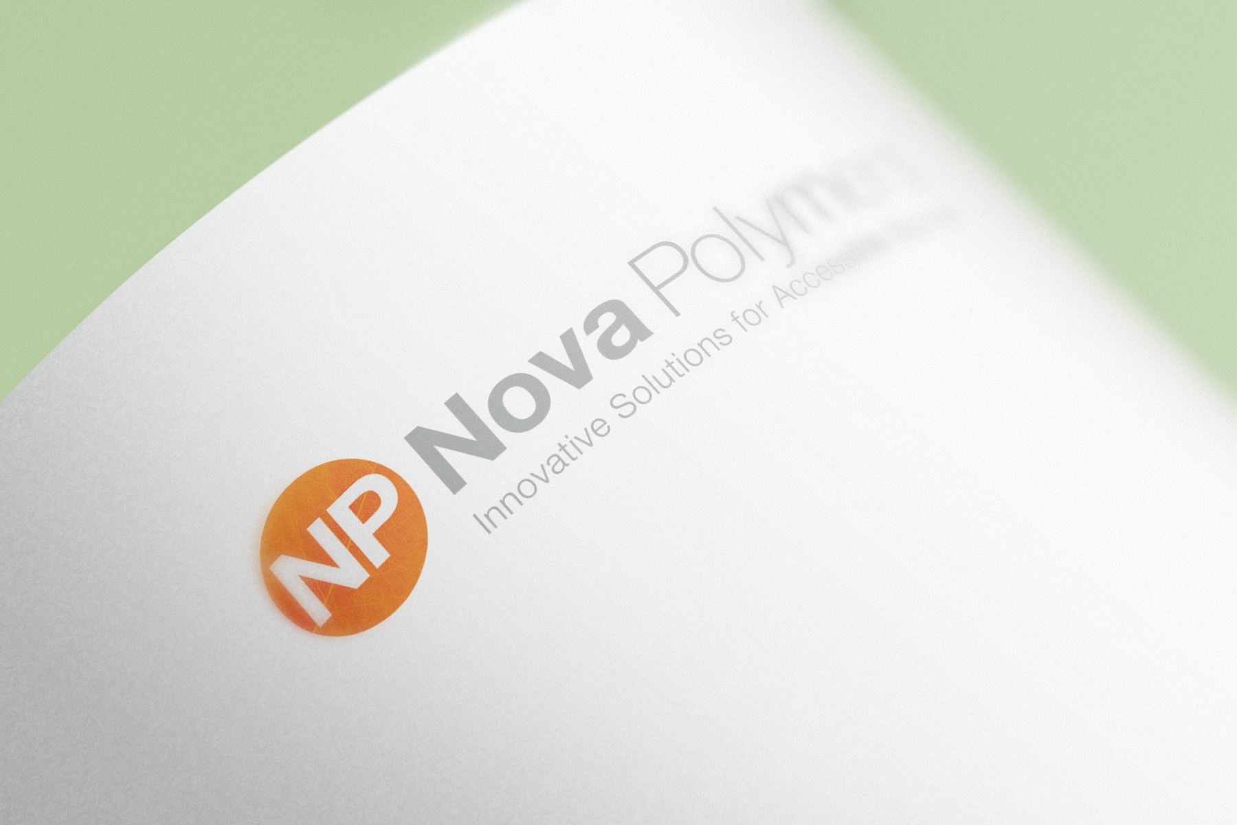
The Icon
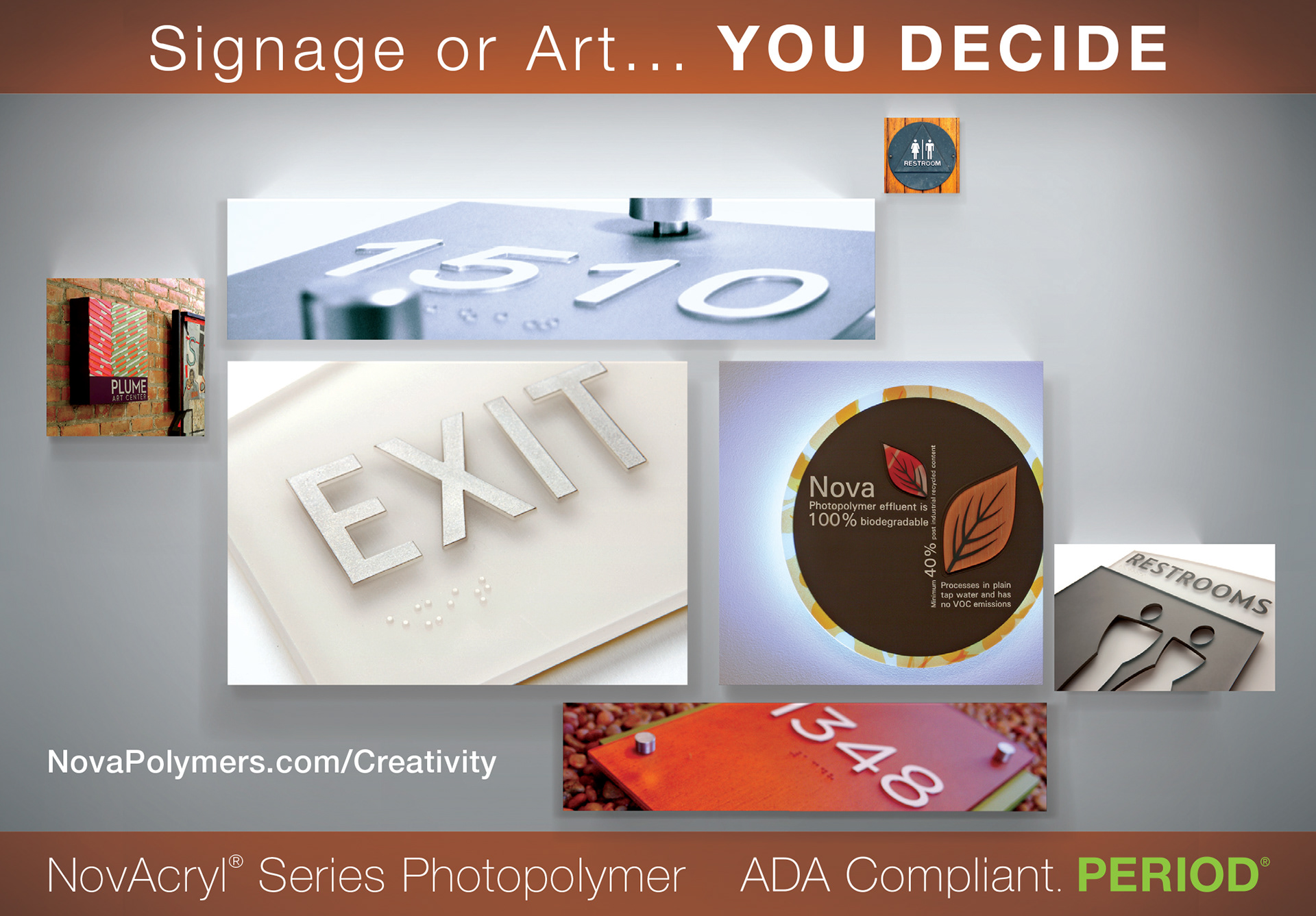
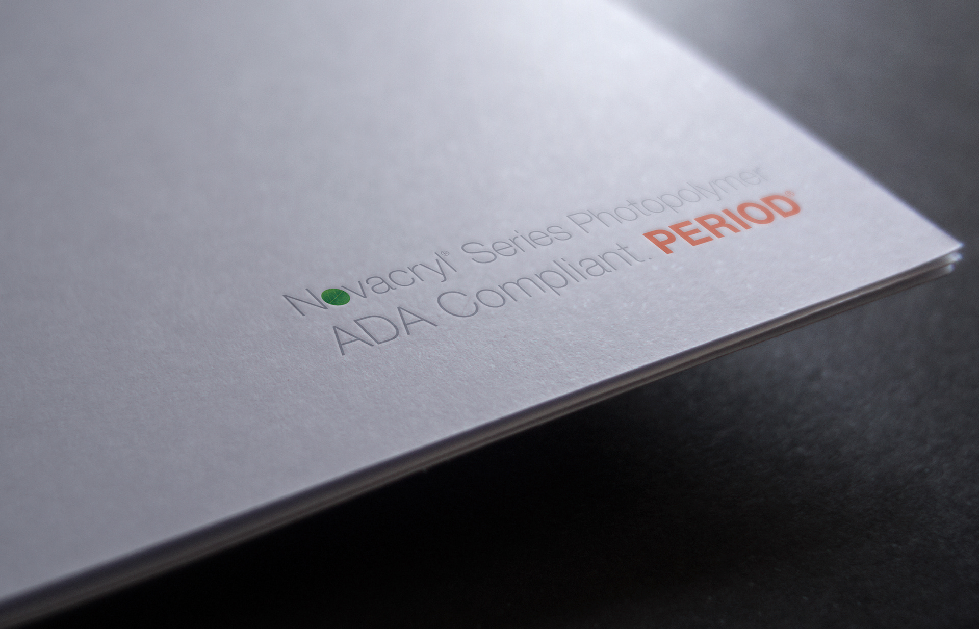
While the leaf had built tremendous brand capital for Nova, it has become increasingly similar to the all of the other “green” paraphernalia pumped into the atmosphere by the architectural community. By keeping the leaf inside the “dot”, I was able to retain some of that brand recognition while giving NP a much more modern feel and a more meaningful icon. “The Dot”, After all that is what Nova is concentrated on. Accessible Signage (read: Braille). A dot, a simple shape, but through Nova’s Photopolymer process has transformed the accessible signage industry and allowed designers to finally see their designs unobstructed by the ADA Code.
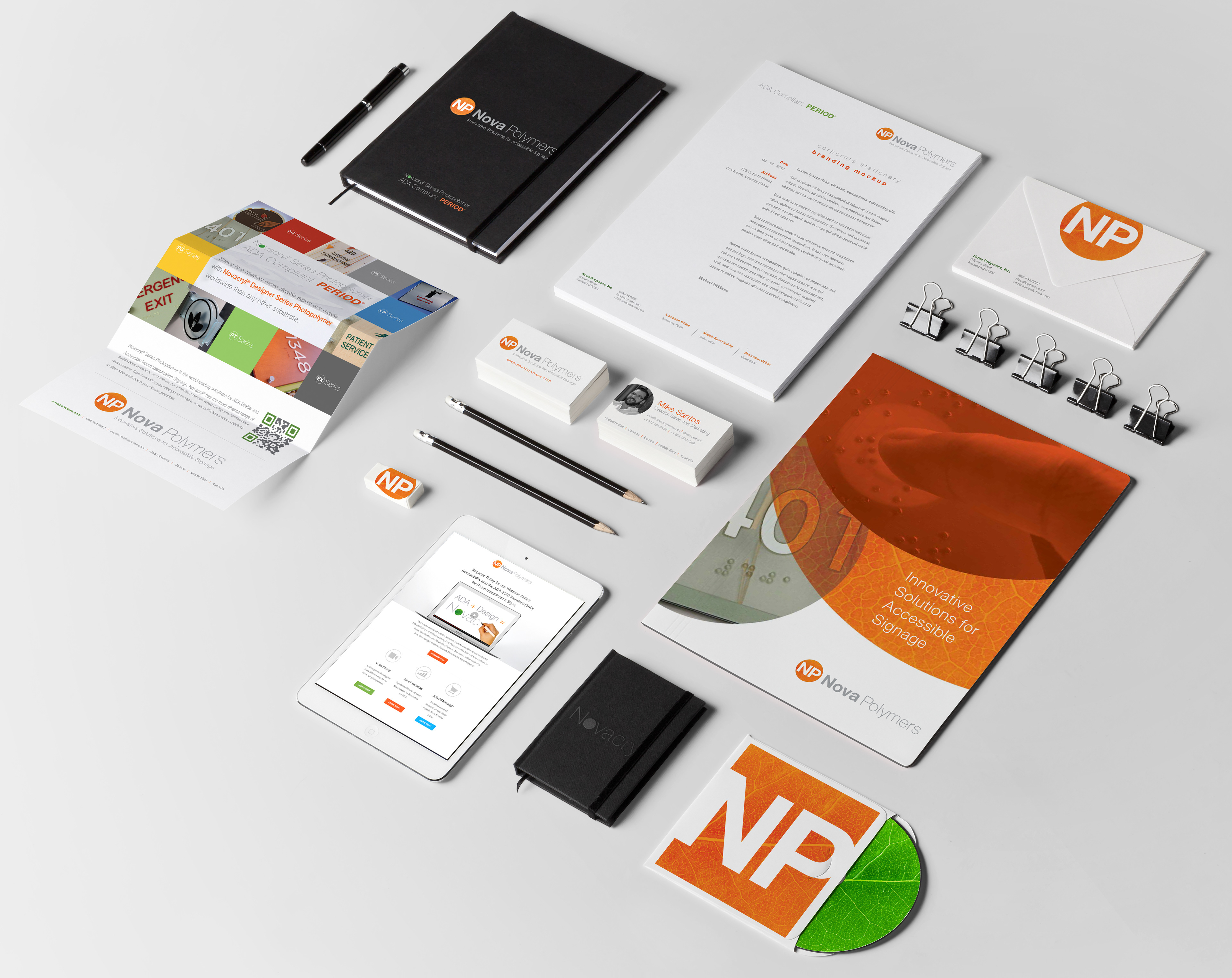

Marketing Collateral
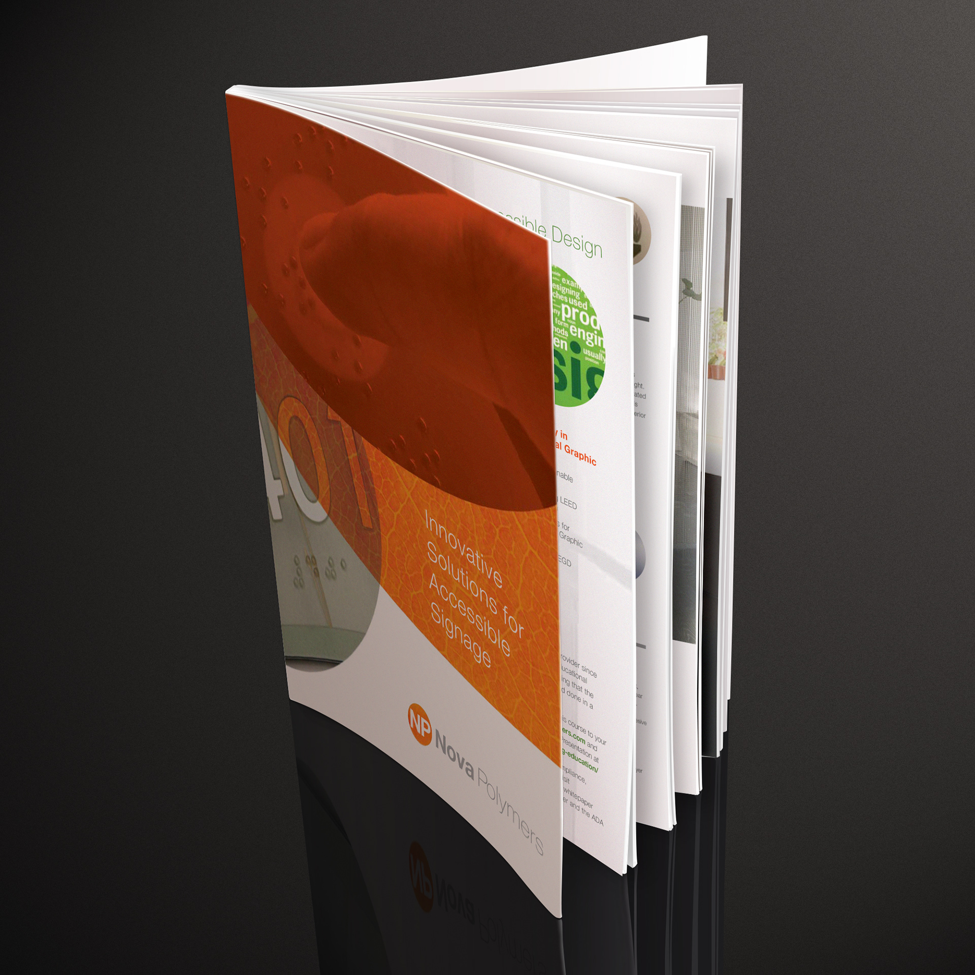
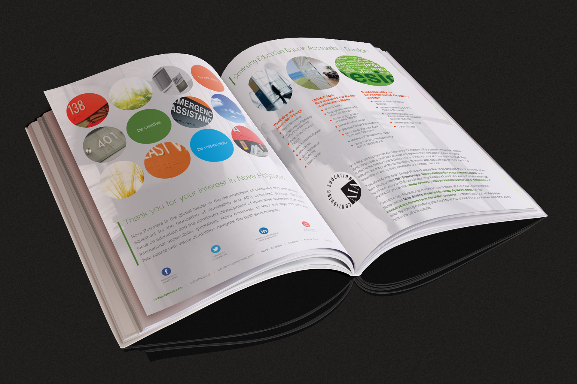
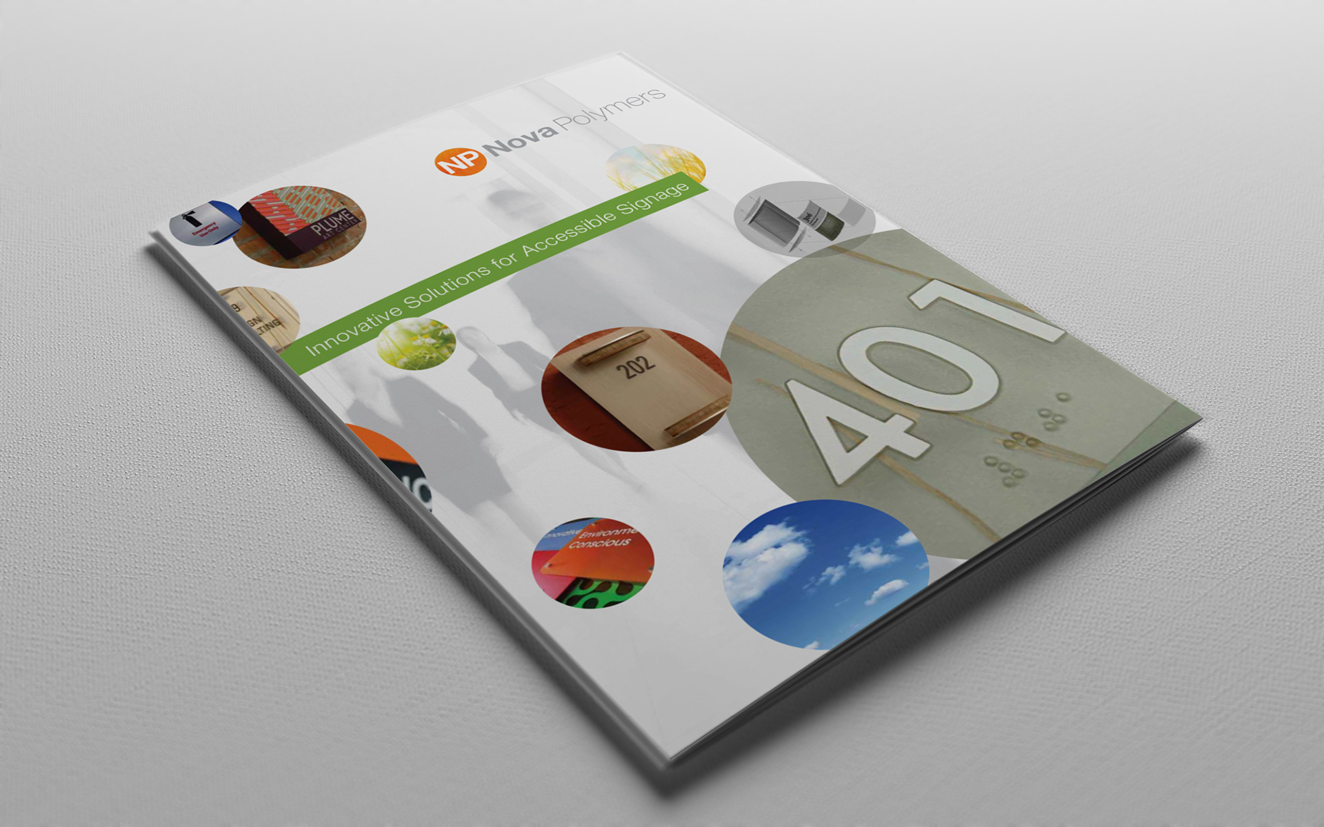
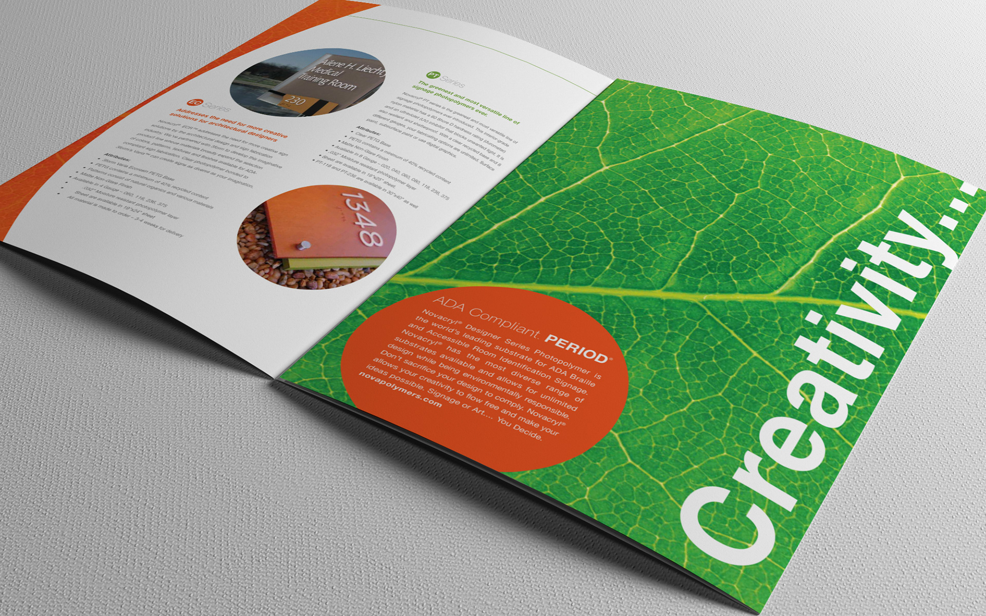
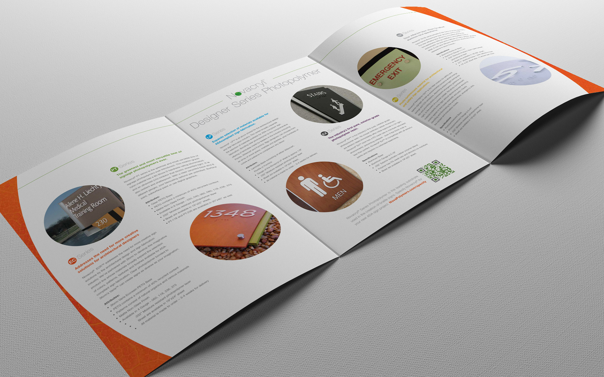
Nova Polymers has been marketing themselves heavily throughout the Sign Industry for many years. So with the rebrand came the delicate balance of rebranding all of their collateral while keeping a reasonable budget. The redesign consisted of redesigning Brochures, Catalogs, Spec Books, Architectural Specifications, Hundreds of PDF downloads, Corporate Stationery, Website, Social Media, Email Marketing, print & web advertisements plus trade-show graphics.

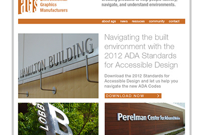
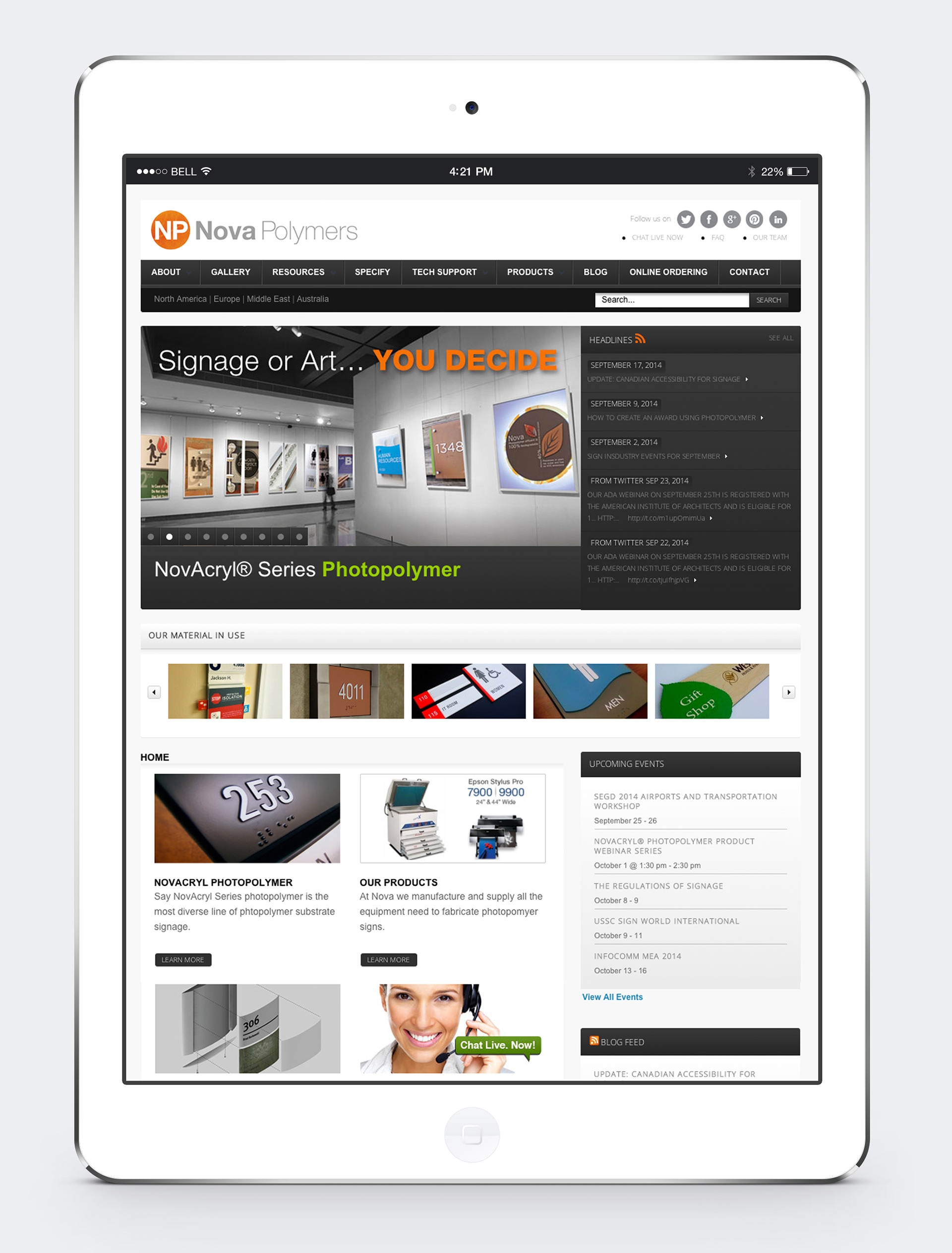
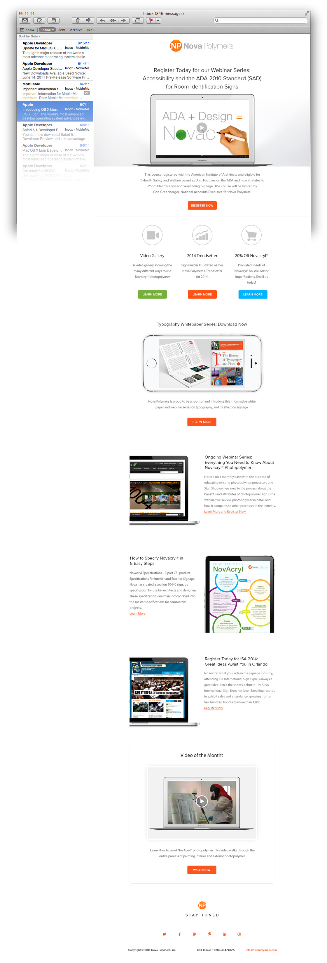
The Website
Nova Polymers website not only serves as a brochure for their product, but it also contains a depth of valuable information for the accessible sign manufacturing and design communities. It was a six month challenge making sure that thousands of downloadable documents, educational webinar materials, prices sheets and white papers not only contained the new branding but were brought up to date in the process to maintain Nova’s commitment to being on the forefront of Education for the Accessible Signage Industry.
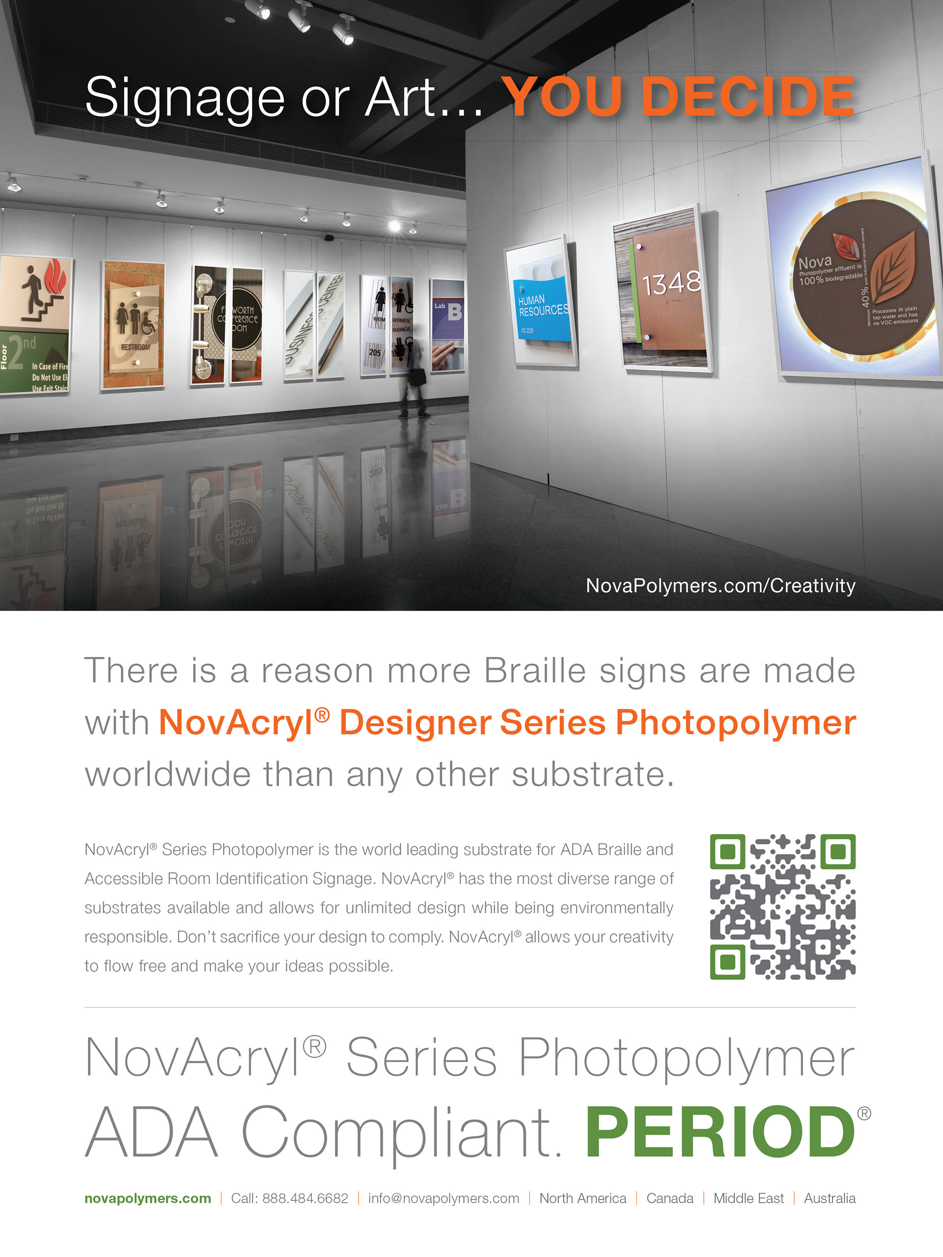
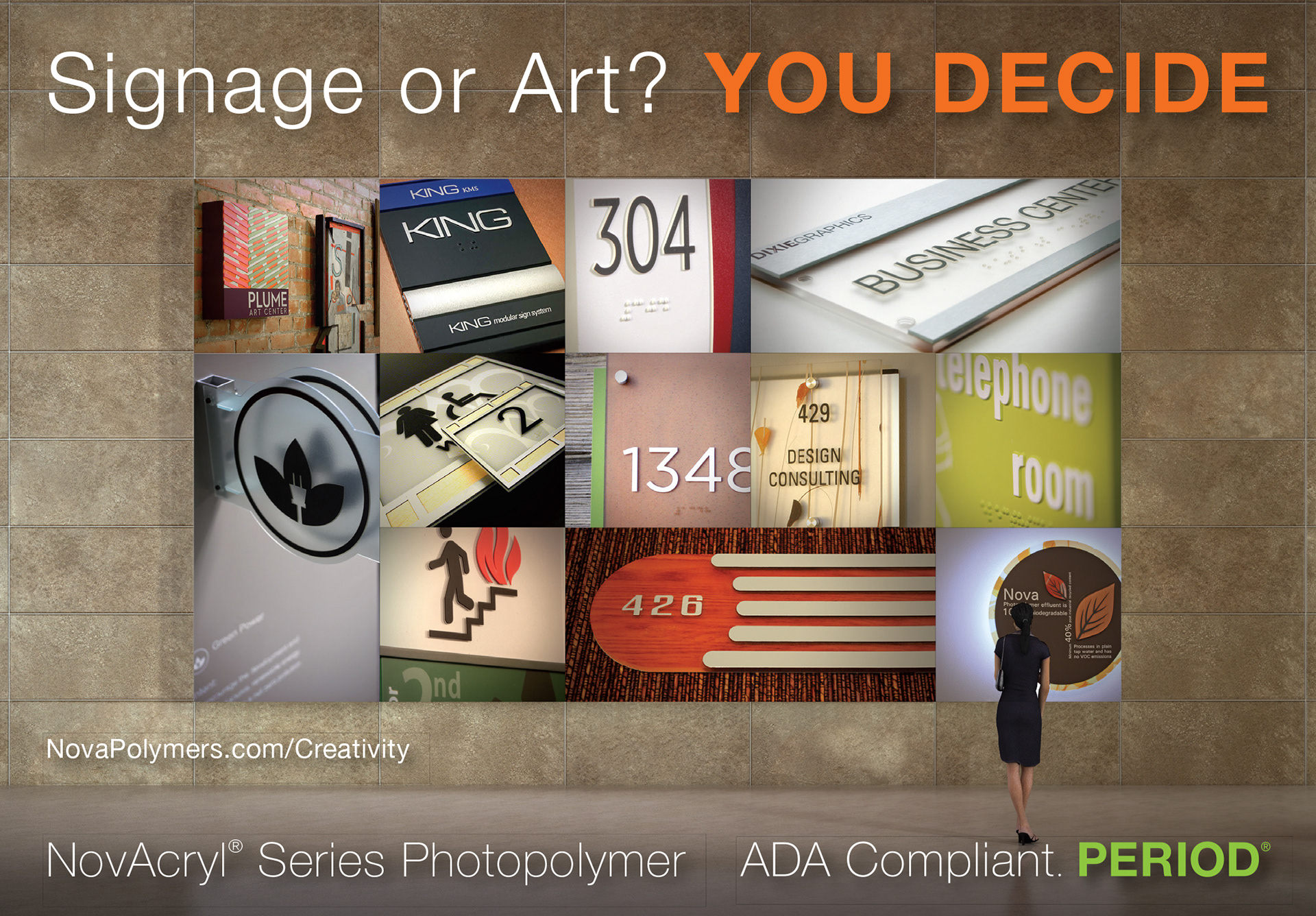
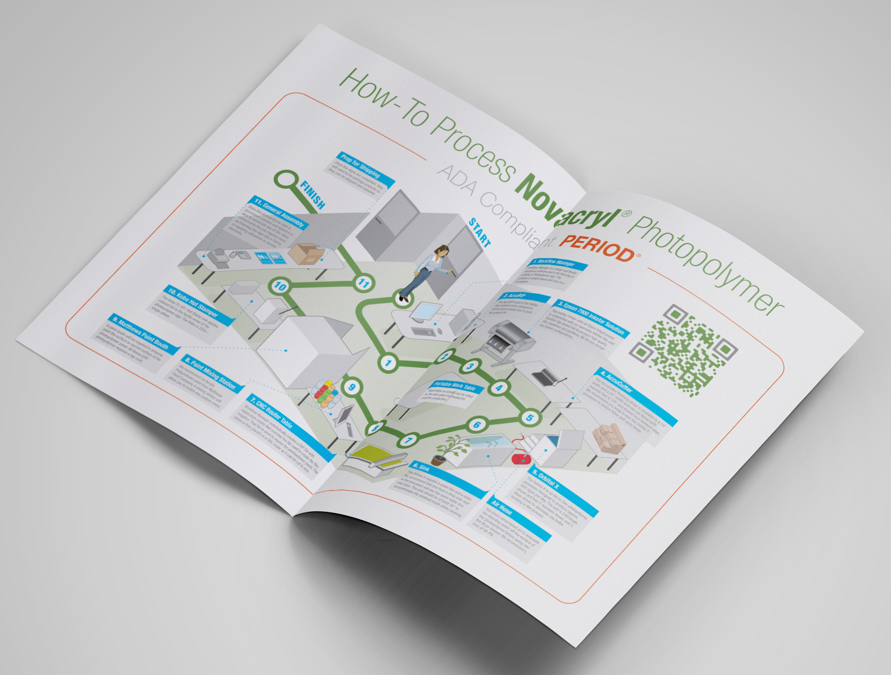
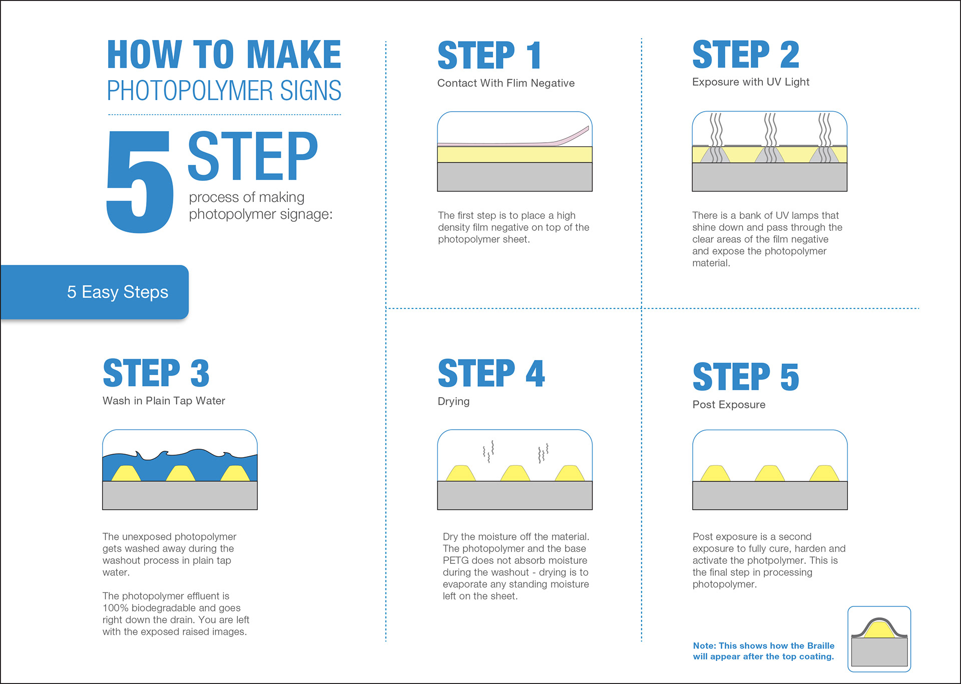
Literature, Advertising and Technical Infographics
Along with the rebrand, I developed a series of info-graphics and literature pieces in order to educate both the sign designer who specifies Nova Polymers Novacryl® line and the sign manufacturer who works with their innovative equipment and materials. This has posed a few unique problems to be solved as both communities are looking for vastly different information and resources. Be segregating the two categories completely, I helped Nova communicate at a higher level with each unique target customer.